
Government · UX/UI
Redesigning
MySkillsFuture
MySkillsFuture.sg gives Singaporeans access to career guidance, skills training, and job opportunities. The original site struggled with usability, accessibility, and conversion. This case study walks through the redesign, guided by UX principles, to make it more intuitive, personalized, and mobile friendly.
Visit myskillsfuture.gov.sgUnderstanding users
We ran interviews and surveys with 50 users, including students, mid career professionals, and job seekers, to understand what wasn't working for them.
Key Findings
75%
of users found navigation frustrating
70%
wanted their desired action available immediately on landing
50%
preferred a personalized dashboard with tailored recommendations
Competitive Analysis
We looked at platforms like Coursera and LinkedIn Learning to see what they were getting right in streamlined navigation and onboarding, personalized recommendations, and mobile first, accessible design.
Users value simplicity, personalization, and a seamless transition between desktop and mobile.
Identifying core problems
Synthesizing the research surfaced recurring pain points that were quietly working against user engagement and trust.
01
Cluttered Interface
Overloaded with information, causing confusion and cognitive overload.
02
Poor Mobile Optimization
Difficult to navigate and use on mobile devices.
03
Complex User Flow
Users struggled to locate relevant courses, subsidies, and tools.
04
Inconsistent Design
Lack of hierarchy and outdated UI components.
05
Low Conversion Rate
Few users completed desired actions such as registration or enrollment.
06
Limited Personalization
Generic content that failed to engage diverse user segments.
Users experienced difficulty navigating and engaging with MySkillsFuture.sg due to cluttered content, inconsistent design, and poor personalization, leading to low task completion and conversion rates.
What the redesign had to do
- Simplify navigation and information hierarchy.
- Improve mobile responsiveness and usability.
- Introduce personalized dashboards for user engagement.
- Establish a consistent, modern UI aligned with accessibility standards.
How we planned to get there
- A revamped navigation system with clear categorization and a predictive search bar.
- A mobile first design approach with responsive grids and touch friendly elements.
- A personalized home dashboard showcasing relevant courses and quick actions.
- Modern UI and accessibility improvements based on WCAG guidelines.
Bringing ideas to life
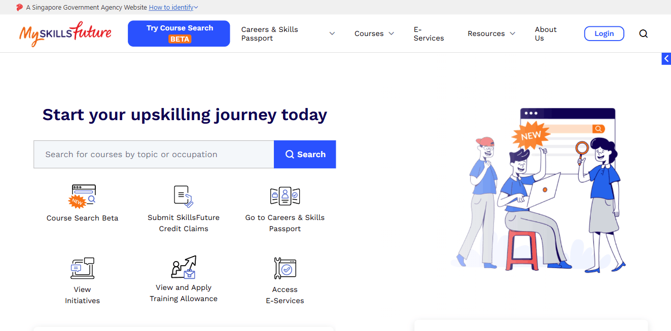
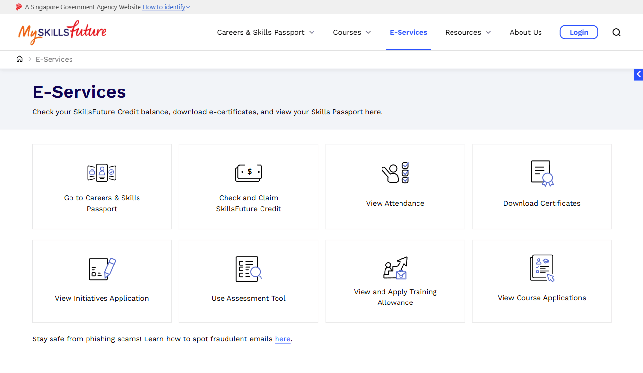
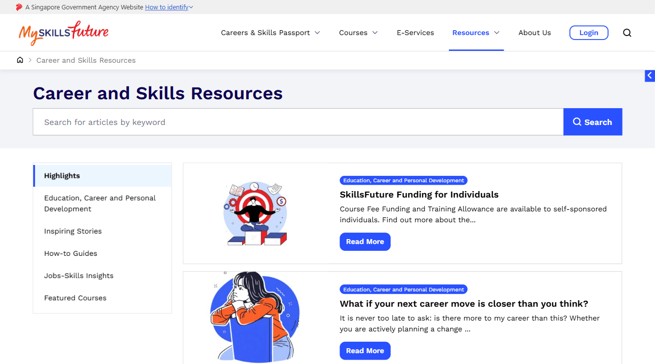
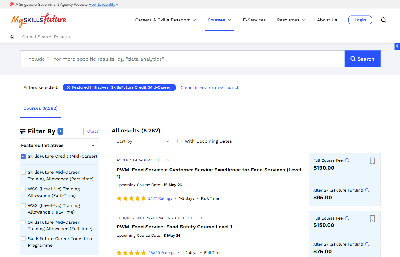
Concepts became low fidelity wireframes to validate the navigation flow, then high fidelity prototypes for usability testing and stakeholder presentations.
Visual Design & Style Guide
A design system was built to keep the platform consistent, scalable, and accessible across web and mobile.
12 column responsive grid
Flexible layouts that adapt smoothly across screen sizes and devices.
4pt spacing system
Consistent spacing and alignment across every component, improving visual rhythm.
A clear visual hierarchy
Accessible color contrast, readable font pairings, and recognizable icons.
A reusable UI library
Buttons, inputs, cards, and alerts built once for consistency and faster development.
A cohesive, modern, accessible design system that scales across web and mobile while keeping the brand and user experience unified.
Validating the redesign
We ran A/B usability testing with clickable prototypes, comparing two design variations. Users completed key tasks such as finding courses, checking SkillsFuture Credit eligibility, and navigating to their personalized dashboard.
Testing Results
40%
faster task completion on the redesigned version
55%→85%
increase in user satisfaction
30%
improvement in mobile engagement
Higher
click throughs for course enrollments and sign ups
A clear, action oriented homepage and a personalized dashboard significantly improved user engagement, confidence, and task success.
Delivering the solution
We worked closely with developers to keep design and development consistent using the new style guide and component library, then monitored post launch analytics to track engagement and find further opportunities to improve.
A platform people can actually use
The MySkillsFuture.sg redesign addressed the core usability issues and delivered a cleaner, faster, more personalized experience. By working through the full UX process, from Empathize to Implement, the platform now better supports Singaporeans in their learning and career journeys, with higher engagement, accessibility, and conversion to show for it.
A well designed UX process does not just fix a website. It rebuilds the trust that makes people want to use it.
Next Project
Enterprise · UX/UI · 2024